✨ Master Color Psychology & Modern Design Systems

Master the Science, Psychology & Art of Color

Explore 20+ comprehensive masterclasses by Maryse Erdman covering Newtonian physics, harmonious palette formulas, WCAG accessibility standards, and high-conversion UX design systems.

⚡ Latest Research & Masterclasses

Explore In-Depth Color Studies & Guides

Curated research articles on color physics, psychological triggers, harmonious palettes, and WCAG accessibility standards.

How to Assign UI Colors for Backgrounds, Text, Buttons, and Error States
Interface Design / Practical UI Systems Give every interface color a clear purpose. A reliable color system helps people read content, recognize actions, understand feedback, and navigate an interface without confusion. Choosing colors for a website or application involves much more than finding an attractive palette. A button needs to look interactive. Text must remain … Read more
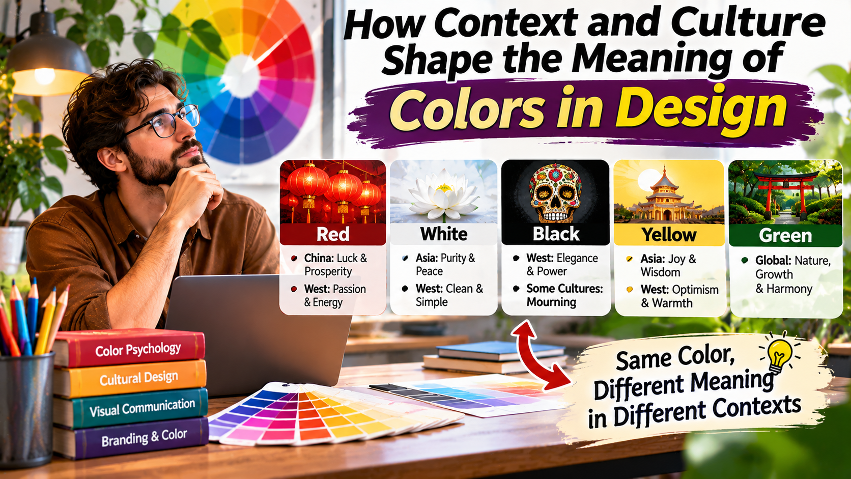
How Context and Culture Shape the Meaning of Colors in Design

The Cultural Design Journal / Color & Meaning The same color can tell a completely different story. Colors do more than decorate a design. Their meanings change with culture, context, personal experience, and the way they are presented. Imagine seeing a red button on a website. Depending on its label and surrounding design, you might … Read more

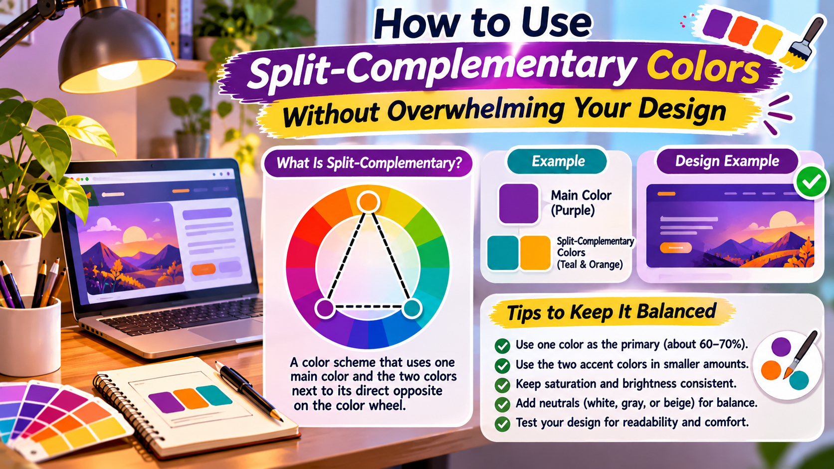
How to Use Split-Complementary Colors Without Overwhelming Your Design

Color Theory / Design Workshop Three colors. One balanced visual direction. Split-complementary palettes combine contrast with flexibility. The secret is not using all three colors equally, but giving each one a clear purpose. Choosing colors for a website, logo, illustration, or presentation can become frustrating when every combination feels either too plain or too intense. … Read more

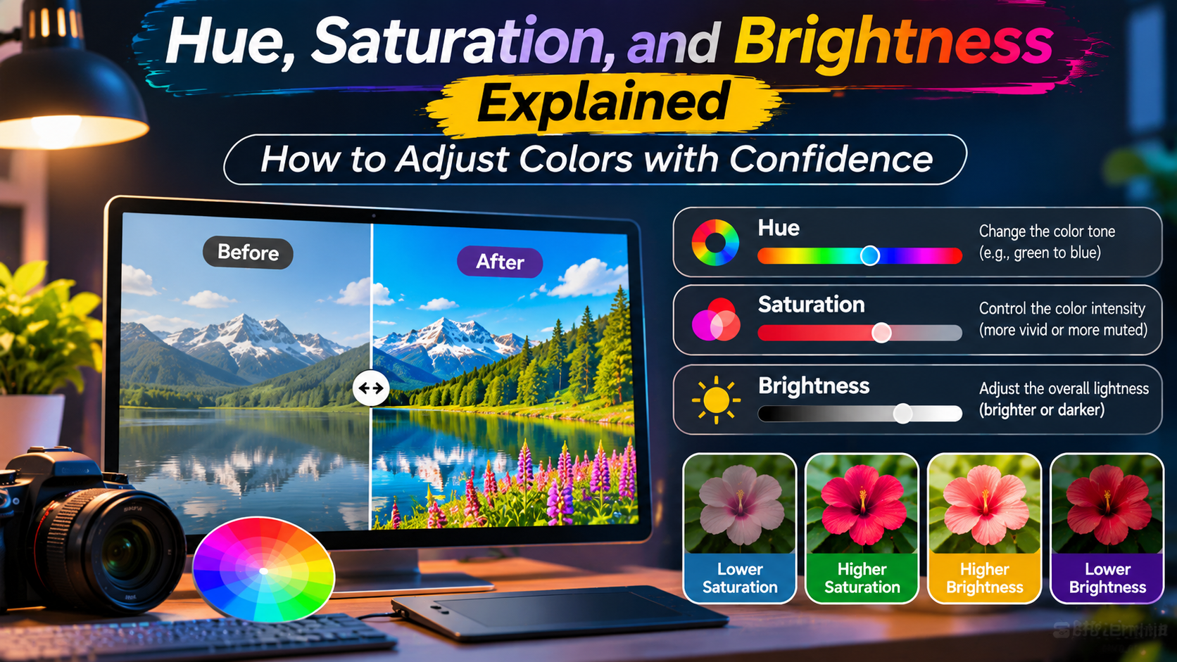
Hue, Saturation, and Brightness Explained How to Adjust Colors with Confidence

The Creative Color Studio Understand color. Make better adjustments. Hue changes the color family, saturation changes its intensity, and brightness changes how light or dark it appears. Together, these controls make color editing more predictable. You open a photo editor and notice that the colors do not look quite right. The blue sky appears dull, … Read more

Typography and Background Contrast: Readability Rules Every Designer Must Follow

Guide Summary ⏱️ 16 Min Read • Complete AdSense Authority Guide Typography is the foundation of human digital communication—over 90% of the information consumed on the internet is written text. In this definitive concluding masterclass of our Color Theory Laboratory series, master the optical physics of typographic readability, the dangers of stark black-and-white contrast glare, … Read more

Call-to-Action (CTA) Color Strategy: How Buttons and Accent Hues Drive Conversions

Guide Summary ⏱️ 16 Min Read • Complete AdSense Authority Guide In modern digital commerce and SaaS product design, billions of dollars in revenue hinge upon a single UI component: The Call-to-Action (CTA) Button. In this comprehensive conversion rate optimization (CRO) masterclass, decode the cognitive neuroscience behind user clicks, the Von Restorff Isolation Effect, the … Read more

The 60-30-10 Rule in UI/UX and Interior Design: Balancing Visual Proportions

Guide Summary ⏱️ 16 Min Read • Complete AdSense Authority Guide Even the most gorgeous color palette in the world will look like a chaotic mess if colors are distributed in equal, fighting proportions. In this definitive masterclass, master the timeless 60-30-10 Proportional Rule utilized by top interior architects, Hollywood cinematographers, and UI/UX product leads. … Read more

Color Accessibility and WCAG Guidelines: Designing for Color Blindness and High Contrast

Guide Summary ⏱️ 16 Min Read • Complete AdSense Authority Guide Over 350 million people worldwide live with Color Vision Deficiency (CVD)—including 1 in 12 men and 1 in 200 women. Designing accessible color palettes is not only an ethical imperative; under the Americans with Disabilities Act (ADA) and European Accessibility Act (EAA), it is … Read more

Dark Mode Color Palettes: Contrast, Readability, and Eye Fatigue Prevention

Guide Summary ⏱️ 16 Min Read • Complete AdSense Authority Guide Over 82% of smartphone users and software developers operate their primary operating systems in Dark Mode. Yet building a high-performing dark interface is not as simple as flipping white backgrounds to black. In this definitive technical masterclass, decode the optical ergonomics of scotopic vision, … Read more

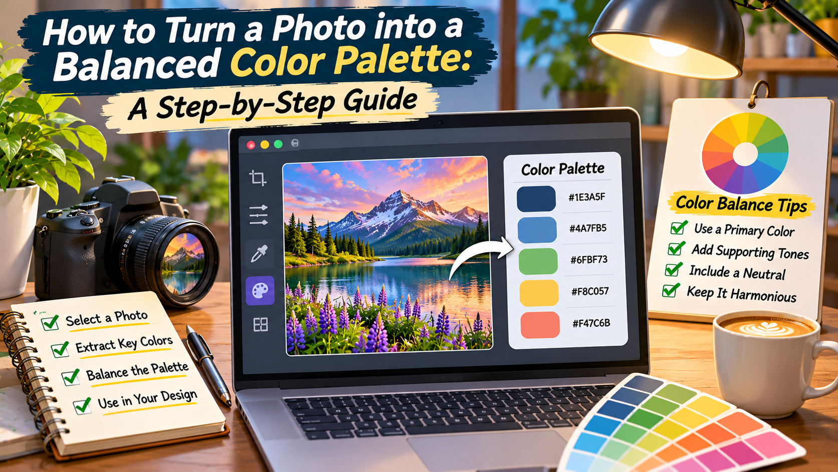
Nature-Inspired Color Palettes: Translating Sunsets, Oceans, and Forests into Codes

Guide Summary ⏱️ 16 Min Read • Complete AdSense Authority Guide Nature is the world’s most accomplished color art director—effortlessly blending thousands of harmonized wavelengths without a single clashing tone. In this comprehensive technical masterclass, discover how to translate natural landscapes (sunsets, deep oceans, ancient forests, and desert canyons) into production-ready digital color tokens. Explore … Read more