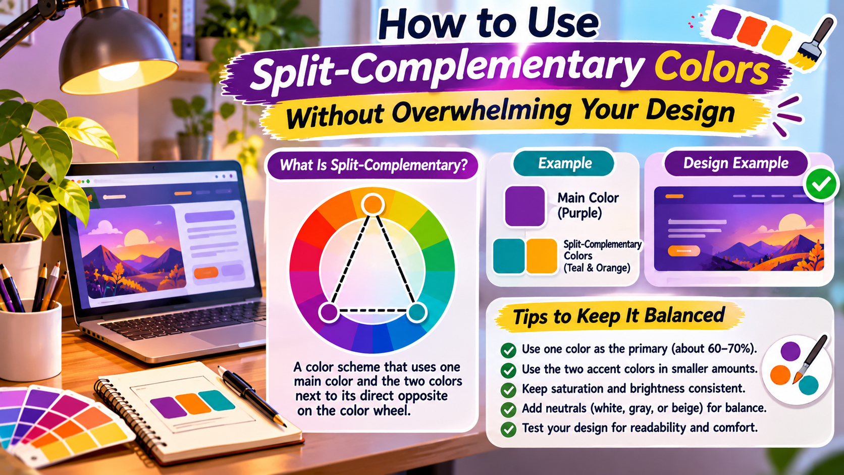
Color Theory / Design Workshop
Three colors. One balanced visual direction.
Split-complementary palettes combine contrast with flexibility. The secret is not using all three colors equally, but giving each one a clear purpose.
Choosing colors for a website, logo, illustration, or presentation can become frustrating when every combination feels either too plain or too intense.
Complementary colors create strong contrast, but placing two highly saturated opposites next to each other can make a design feel visually aggressive.
Split-complementary colors offer another approach.
Instead of pairing one color with its direct opposite on the color wheel, this method uses the two colors positioned on either side of that opposite.
The result is a three-color relationship that provides contrast while allowing more variety.
However, a split-complementary palette is not automatically balanced. Poor proportions, excessive saturation, and weak contrast can still produce an overwhelming design.
This guide explains how the color relationship works and how to apply it confidently in practical design projects.
What Is a Split-Complementary Color Scheme?
A split-complementary color scheme begins with one base hue.
Instead of selecting the hue directly opposite it on the color wheel, you choose two hues located on either side of that opposite.
For example, if blue is your base color, its traditional complement is orange.
A split-complementary approach might use blue with yellow-orange and red-orange.
The exact hues depend on the color wheel and the angular spacing you choose.
In a simplified 12-part traditional color wheel, split-complementary combinations are often described using the two neighboring colors of the direct complement.
In a digital hue wheel, designers can choose a consistent angle on either side of the opposite hue.
The Basic Formula
One base hue + two hues surrounding its complement = a split-complementary palette.
This creates a relationship that is less directly oppositional than a standard complementary pair while retaining noticeable color contrast.
Why Split-Complementary Colors Work
Split-complementary schemes are popular because they offer both contrast and variety.
A monochromatic palette uses variations of one hue, which can create consistency but may feel limited in some projects.
An analogous palette uses neighboring hues, often producing a harmonious appearance.
A complementary palette uses opposing hues, creating strong visual separation.
Split-complementary colors occupy a useful middle ground.
They provide a dominant hue and two contrasting alternatives without relying entirely on a single opposite color.
That flexibility can help designers distinguish buttons, illustrations, categories, and supporting elements.
However, the relationship between hues is only one part of color harmony.
Saturation, brightness, proportion, spacing, typography, and surrounding neutral colors all influence the final result.
Start With a Dominant Color
The most important decision is choosing which color will lead the design.
A common mistake is treating all three colors as equally important.
When each color competes for attention, the design can become visually fragmented.
Instead, begin with one dominant hue that supports the project’s personality and purpose.
For example, a financial dashboard might use a restrained blue as its primary color.
A wellness brand might choose a soft green.
A creative portfolio might use a more expressive violet or coral.
The base color should establish the visual identity.
The remaining two hues should support it through accents, highlights, or selective contrast.
Design Principle
One color leads. Two colors support.
A palette feels more controlled when each hue has a defined role rather than competing for equal attention.
How to Find Split-Complementary Colors on a Color Wheel
You can build a split-complementary palette manually or with a digital color picker.
Start by choosing a base hue.
Find its direct complement, which sits approximately 180 degrees away on a standard digital hue wheel.
Then select two hues on either side of that complementary position.
For example, consider a base hue of 210 degrees.
Its direct complement is at 30 degrees.
If you choose a 30-degree split on each side, the supporting hues become 0 degrees and 60 degrees.
This produces a blue, red, and yellow relationship.
A narrower split produces colors closer to the direct complement, while a wider split changes the relationship.
There is no requirement to use only one angular distance in every project.
The important principle is that the two supporting hues flank the complement of the base color.
Use the 60-30-10 Rule as a Starting Point
The 60-30-10 rule is a common design guideline for distributing visual emphasis across a palette.
It suggests using approximately 60% of one dominant color, 30% of a secondary color, and 10% of an accent color.
This is not a mathematical requirement.
It is a practical way to avoid giving every color equal visual weight.
In actual interface design, neutral colors often occupy a substantial portion of the screen.
Therefore, the 60-30-10 rule may apply more usefully to the distribution of colored elements rather than every pixel on the page.
For example, a website might use a white background, dark text, a blue primary brand color, and two split-complementary accent colors.
The overall result can remain calm even when the accent colors are relatively vivid.
Three Practical Split-Complementary Palette Ideas
Color theory becomes easier to apply when you see how a palette might work in a real project.
The following combinations are illustrative starting points. Their exact relationships depend on the digital hue model, and their saturation and brightness have been adjusted for usability.
Palette One: Calm Blue With Warm Accents
Base: Blue
Supporting colors: Golden orange and muted red-orange
This palette can work for educational websites, editorial graphics, and service brands.
Blue provides a stable foundation, while warm accents can draw attention to important details.
Use the warmest color sparingly for calls to action or highlighted information.
Palette Two: Natural Green With Expressive Highlights
Base: Green
Supporting colors: Muted pink-purple and warm orange
This type of combination can suit lifestyle brands, packaging, and creative illustrations.
Reducing saturation helps prevent the supporting colors from competing too strongly with the green.
Soft neutral backgrounds can make the palette feel more refined.
Palette Three: Purple With Fresh Supporting Colors
Base: Purple
Supporting colors: Green and golden yellow
This combination can work for creative portfolios, educational materials, and playful product identities.
Because all three hues are visually distinctive, it is especially important to control saturation and area.
Use purple for major identity elements and reserve the other colors for selected supporting details.
Reduce Saturation Before Adding More Colors
One of the simplest ways to improve a split-complementary palette is to lower the saturation of one or more colors.
Highly saturated colors attract attention.
When three vivid hues appear together in large areas, the design may feel noisy even if their positions on the color wheel are theoretically balanced.
Muted colors can preserve the underlying hue relationship while making the composition easier to view.
For example, instead of combining electric blue, bright orange, and intense red, try a deep blue with a softer amber and muted terracotta.
The colors remain related, but the visual effect becomes more controlled.
This technique is particularly useful for professional websites, reports, presentations, and brand systems that need to communicate clearly.
Let Neutral Colors Create Breathing Room
A three-color palette does not mean every element must use one of those three hues.
White, off-white, charcoal, gray, and other neutral tones can provide essential visual separation.
For example, a website can use a warm off-white page background, dark charcoal text, and a split-complementary palette for headings, buttons, and illustrations.
This reduces competition between colorful elements.
Neutral space also makes accents more noticeable.
A small orange button on a restrained page may attract more attention than the same button surrounded by several brightly colored sections.
A Useful Website Color Structure
Background: Warm white or light gray
Main text: Dark charcoal
Primary brand color: Dominant hue
Secondary accents: Two split-complementary hues
Interactive states: Accessible variations with clear visual feedback
This structure creates flexibility without forcing every design element to compete for attention.
Applying Split-Complementary Colors to Website Design
Website interfaces benefit from color systems that communicate hierarchy.
Start by assigning the dominant hue to major brand elements such as the logo, primary buttons, or navigation accents.
Use one supporting hue for secondary highlights, category labels, or illustrations.
Reserve the third hue for limited emphasis.
A common mistake is giving multiple unrelated button types equally strong colors.
This makes it harder for visitors to identify the most important action.
Instead, keep primary actions visually consistent.
Use secondary colors for genuinely different functions rather than changing button colors simply for decoration.
Color should reinforce the page’s structure, not replace it.
Spacing, typography, labels, and clear visual grouping remain essential.
Accessibility Matters More Than Color Harmony
A visually attractive palette is not necessarily accessible.
Two colors may form a pleasing relationship on the color wheel while providing insufficient contrast for readable text.
For ordinary text, WCAG guidance generally calls for a contrast ratio of at least 4.5:1 at Level AA.
Large text generally requires at least 3:1.
Important interface components and graphical objects may also have non-text contrast requirements.
Do not assume that a dark-looking hue automatically provides enough contrast against a light background.
Use a reliable contrast-checking tool and test the actual foreground and background colors.
Also avoid communicating important information through color alone.
For example, an error message should include clear text or another meaningful indicator rather than relying only on a red highlight.
Accessibility Reminder
A balanced color wheel does not guarantee readable text. Always check contrast and make sure meaning is not communicated by color alone.
Common Mistakes That Make a Palette Overwhelming
Split-complementary colors can become difficult to manage when their roles are unclear.
The most frequent problem is using all three hues at full saturation.
Another is spreading the accent colors evenly across every section, which removes the sense of hierarchy.
Other mistakes include:
- Using different bright colors for every button or heading.
- Ignoring the influence of surrounding neutral colors.
- Choosing accent colors without considering the brand’s purpose.
- Using colored text on backgrounds with insufficient contrast.
- Adding extra unrelated hues without a clear reason.
- Failing to test the palette on mobile screens and real content.
A useful way to evaluate a palette is to temporarily remove one supporting color.
If the design becomes clearer, the removed color may have been overused or assigned an unnecessary role.
You can then reintroduce it more selectively.
A Simple Exercise for Building Your Own Palette
Choose a base color that reflects the mood of your project.
Next, identify its complement and select two hues on either side.
Create a small palette using those three hues.
Before applying it to a complete design, make three variations.
In the first version, use the original colors.
In the second, reduce the saturation of both supporting hues.
In the third, darken the base hue and use the supporting colors only as accents.
Place each version into a simple mockup containing a heading, paragraph, button, and illustration.
Compare which version communicates the clearest hierarchy.
This exercise helps you judge colors in context rather than selecting them only because they look attractive in isolated swatches.
Frequently Asked Questions
What is the difference between complementary and split-complementary colors?
Complementary colors use two hues positioned opposite each other on a color wheel. Split-complementary schemes use one base hue and two hues on either side of its direct complement.
Are split-complementary colors suitable for professional websites?
Yes. They can provide useful contrast and variety when saturation, proportions, typography, and accessibility are carefully managed.
Do I have to use all three colors equally?
No. A dominant color with two supporting accents usually creates clearer hierarchy than equal distribution.
Can I use neutral colors with a split-complementary palette?
Absolutely. Neutral backgrounds and text colors often make the palette more practical and less visually overwhelming.
Is the 60-30-10 rule mandatory?
No. It is a design guideline rather than a strict rule. Adjust the proportions to suit the content, layout, and purpose of the project.
Final Thoughts
Split-complementary color schemes offer a flexible way to introduce contrast without relying on a single direct complementary pair.
However, the relationship between hues is only the starting point.
A successful palette also depends on how much space each color occupies, how saturated the colors are, and how clearly they support the design’s purpose.
Choose one dominant hue, assign specific roles to the supporting colors, and use neutral space to keep the composition balanced.
Test the palette with real text, buttons, images, and layouts rather than judging isolated color swatches.
Most importantly, make sure the colors support readability and usability.
When these principles work together, a split-complementary palette can feel expressive, organized, and visually confident without becoming overwhelming.
The Practical Design Formula
One dominant hue + two controlled accents
Balance the proportions, soften saturation where needed, include neutral space, and check accessibility before finalizing the design.