The Creative Color Studio
Understand color. Make better adjustments.
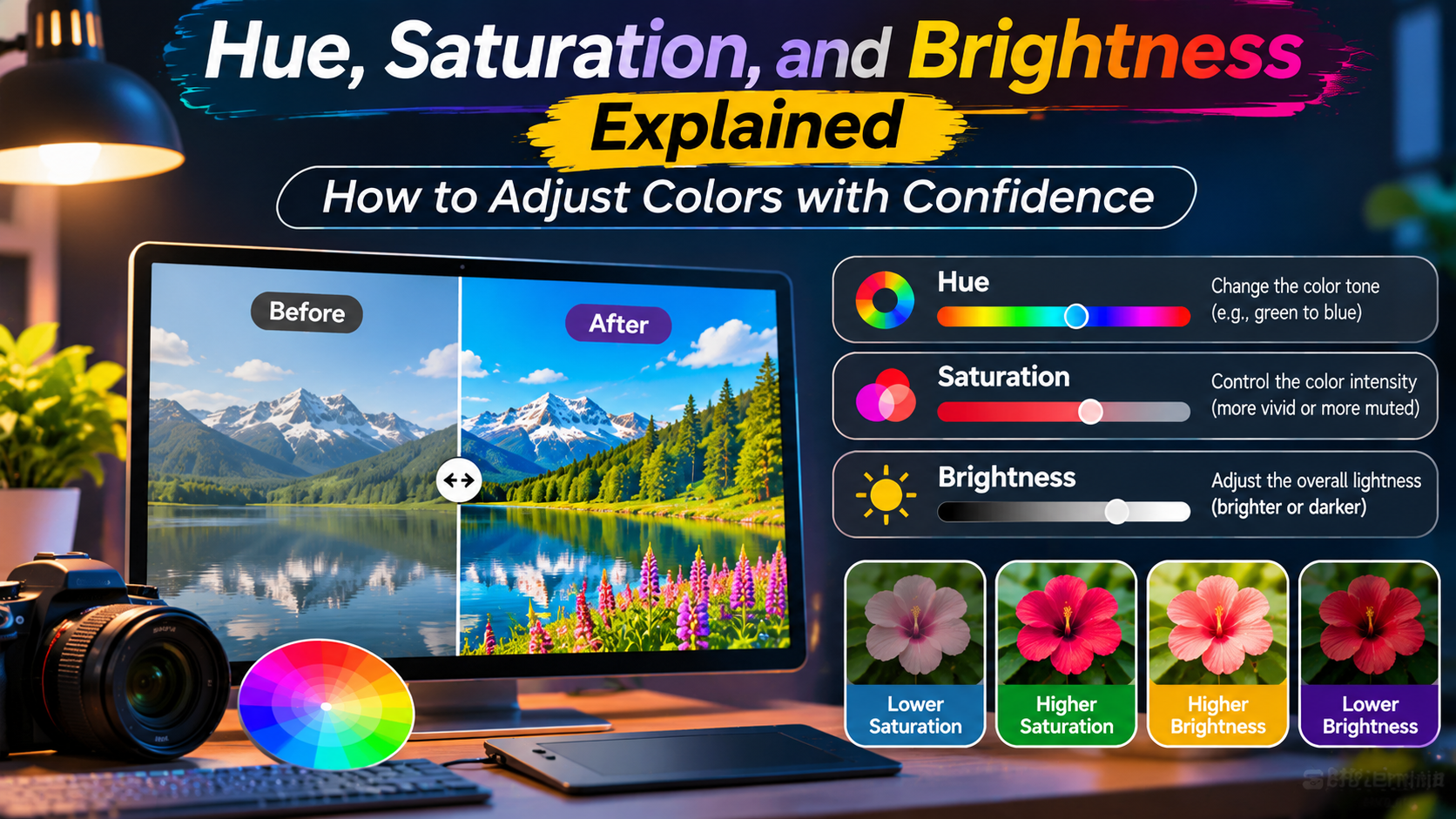
Hue changes the color family, saturation changes its intensity, and brightness changes how light or dark it appears. Together, these controls make color editing more predictable.
You open a photo editor and notice that the colors do not look quite right. The blue sky appears dull, the green leaves look unnatural, and the overall image feels darker than expected.
Most editing applications offer controls labeled Hue, Saturation, and Brightness. Understanding what each control does can help you correct these problems without making the image look artificial.
These three properties are also important in graphic design, website development, digital illustration, product photography, and branding.
Rather than adjusting sliders randomly, learning how color behaves gives you a more reliable starting point.
This guide explains hue, saturation, and brightness in simple terms, shows how they interact, and provides practical techniques for making confident color adjustments.
What Are Hue, Saturation, and Brightness?
Hue, saturation, and brightness are three properties used to describe and adjust colors in the HSB color model.
HSB stands for:
- Hue: The basic color family, such as red, orange, yellow, green, blue, or purple.
- Saturation: How intense or muted the color appears.
- Brightness: How light or dark the color appears within the model.
Many digital applications use the closely related HSV model, where HSV stands for Hue, Saturation, and Value.
In common software usage, brightness and value often refer to the same third component.
However, HSB/HSV brightness should not be confused with perceived brightness or physical light intensity. Human vision responds differently to different hues, and two colors with the same HSV brightness value may not appear equally bright.
HUE
Color Family
Determines whether a color is red, yellow, green, blue, or another position around the color wheel.
SATURATION
Color Intensity
Controls whether a color looks vivid and strong or soft, muted, and grayish.
BRIGHTNESS
Light or Dark
Controls the HSV value, from black at zero to the maximum available channel intensity.
Hue: Choosing the Right Color Family
Hue is the property that identifies a color’s position around the color wheel.
In the HSV color model, hue is commonly measured in degrees from 0° to 360°.
Red is located at approximately 0°, green at 120°, and blue at 240°.
Other colors fall between these reference points.
| Hue Angle | Approximate Color |
|---|---|
| 0° | Red |
| 30° | Orange |
| 60° | Yellow |
| 120° | Green |
| 180° | Cyan |
| 240° | Blue |
| 300° | Magenta |
| 360° | Red again |
The hue scale forms a circle, so 0° and 360° represent the same hue.
When you move a hue slider, you rotate through different color families.
For example, changing the hue of a saturated blue object toward cyan can make it appear more turquoise.
Moving the hue toward purple creates a different visual effect.
Hue adjustments are useful when correcting color casts, changing the color of an object, or creating alternative brand palettes.
However, changing hue too aggressively can make familiar objects look unnatural.
Saturation: Making Colors Vivid or Muted
Saturation controls the intensity of a color.
In a typical HSV interface, saturation ranges from 0% to 100%.
At 100% saturation, a color has the maximum saturation available for its selected hue and brightness.
At 0% saturation, the color becomes a shade of gray, regardless of the hue setting.
For example, imagine a bright red color.
Reducing its saturation gradually makes it appear less intense.
At low saturation, the color may resemble a muted rose or grayish red, depending on brightness.
Example: Red at Different Saturation Levels
100%
60%
30%
0%
Illustrative HSV colors with red hue and brightness held at 100%. At zero saturation and maximum brightness, the result is white.
Saturation is especially useful in photography.
Increasing saturation can make landscapes, flowers, and colorful objects appear more vivid.
Reducing saturation can create a softer, calmer, or more restrained appearance.
However, excessive saturation may cause colors to lose detail or appear unrealistic.
For professional-looking results, moderate adjustments are often more effective than pushing the slider to its maximum.
Brightness: Controlling Light and Dark Values
Brightness, also called value in HSV, describes the maximum intensity of the RGB channels used to represent a color.
It is commonly expressed as a percentage.
At 0% brightness, the result is black.
At 100% brightness, the color reaches the maximum channel intensity allowed by the selected hue and saturation.
For example, a saturated blue can become darker as brightness decreases.
At very low brightness, the color may appear almost black.
Increasing brightness can make the same hue appear more prominent, although the visual result depends on saturation and the display.
Example: Blue at Different Brightness Levels
100%
70%
40%
0%
Hue and saturation remain fixed while HSV brightness changes.
Brightness adjustments can help darken interface elements, create color variations, or refine digital artwork.
In photography, however, a basic brightness control may affect the image differently from exposure, highlights, shadows, or curves.
Those controls are not interchangeable.
How Hue, Saturation, and Brightness Work Together
The three controls are related, but each changes a different property.
Imagine starting with a vivid orange color.
If you change the hue, the orange can become yellow, red, or another color.
If you reduce saturation while keeping hue and brightness constant, the orange becomes less colorful.
If you reduce brightness, the orange becomes darker.
Combining these adjustments creates a wide range of colors from a single starting point.
A Simple Way to Remember
Hue: Which color?
Saturation: How colorful?
Brightness: How light or dark in HSV?
For many design tasks, it helps to adjust one property at a time.
This makes it easier to understand which change improved the result and which one created a problem.
HSB vs HSL: Are They the Same?
HSB and HSL are closely related color models, but they are not identical.
HSB usually refers to Hue, Saturation, and Brightness, corresponding to HSV.
HSL stands for Hue, Saturation, and Lightness.
Both models describe colors using hue and two additional components, but their mathematical definitions differ.
For example, a fully saturated red has HSV brightness of 100% and HSL lightness of 50%.
This does not mean the color is darker in one model. The models simply use different ways to represent the same RGB color.
That distinction matters when transferring color values between applications or writing CSS.
CSS commonly supports HSL color notation, while many graphic design applications provide HSV or HSB color pickers.
Do not assume that copying the same numeric saturation and brightness/lightness values between the two models will produce the same color.
How to Adjust Colors in a Photo Without Overediting
Photo editing becomes easier when you approach color adjustments in a deliberate order.
Start With the Overall Color Balance
Before changing individual hues, check whether the photograph has an unwanted warm or cool color cast.
White balance controls are often better suited to correcting this problem than a global hue slider.
Adjust Saturation Carefully
If the entire photograph looks dull, try a modest saturation adjustment.
Some editors also provide a vibrance control that affects colors differently from ordinary saturation.
Vibrance can be useful, but its exact behavior varies between applications.
Refine Specific Color Ranges
Many editing tools provide individual controls for reds, oranges, yellows, greens, blues, and other color groups.
These can help adjust a sky without changing every color in the photograph.
For example, slightly shifting cyan toward blue may change the appearance of water or sky.
However, selective adjustments can also affect clothing, signs, and other objects containing similar colors.
Compare Before and After
Repeatedly toggle the original image and edited version.
This helps reveal whether the adjustments genuinely improve the photograph or simply make it more dramatic.
Pay particular attention to skin tones, neutral objects, and areas with subtle color transitions.
Using HSB for Website and Brand Design
Hue, saturation, and brightness are useful when creating consistent visual identities.
Suppose a brand uses a teal primary color.
Instead of choosing every supporting color randomly, a designer can adjust saturation and brightness to create related shades.
A darker teal may work for headings or navigation backgrounds.
A lighter, less saturated version may work for cards and section backgrounds.
A contrasting accent color can be selected using the color wheel.
However, matching hue relationships does not automatically guarantee good readability.
Text and background colors must provide sufficient contrast, especially for users with low vision or color-vision differences.
For web interfaces, checking contrast against accessibility guidance is more reliable than judging brightness percentages alone.
Practical Brand Palette Example
Deep Teal
Primary Teal
Soft Teal
Warm Accent
An illustrative palette showing how related shades and a contrasting accent can create visual hierarchy.
Common Mistakes When Adjusting Colors
Color editing can produce disappointing results when adjustments are made without considering the full image or design.
One common mistake is increasing saturation too much.
This may create unnatural skin tones, overly intense vegetation, or distracting backgrounds.
Another mistake is assuming that maximum brightness always produces white.
In HSV, a fully saturated color at 100% brightness can remain strongly colored. White requires zero saturation and maximum brightness.
Other mistakes include:
- Changing global hue when only one object needs correction.
- Confusing HSV brightness with HSL lightness.
- Ignoring color differences between screens.
- Using low-contrast color combinations for important text.
- Editing without comparing the result to the original.
- Assuming that increasing brightness always restores lost image detail.
For reliable results, use moderate adjustments, evaluate colors in context, and check the final image on a reasonably calibrated display when color accuracy matters.
A Simple Color Adjustment Exercise
You can improve your understanding of HSB by experimenting with a single color in any editor that provides HSV or HSB controls.
Start with these values:
Starting Color
Hue: 210°
Saturation: 70%
Brightness: 90%
First, change only the hue and observe the new color family. Next, restore the original hue and reduce saturation. Finally, restore saturation and lower brightness.
This exercise demonstrates how each control contributes to the final appearance.
After practicing with a single color, try the same approach with a photograph or website color palette.
Frequently Asked Questions
What is the difference between hue and saturation?
Hue determines the color family, while saturation determines how intense or muted that color appears.
Does increasing brightness make a color white?
Not necessarily. In HSV, a fully saturated color can remain vivid at maximum brightness. White occurs when saturation is zero and brightness is at its maximum.
Is HSB the same as HSV?
In many digital design applications, HSB and HSV refer to the same underlying color model, with brightness and value used as alternative names for the third component.
Should I increase saturation or brightness to improve a dull photo?
It depends on the problem. Saturation affects color intensity, while brightness-related controls affect light and dark values. A dull photo may also need adjustments to exposure, contrast, white balance, or local color ranges.
Can HSB help create better website colors?
Yes. HSB can help designers create related color variations and organize a palette. Accessibility contrast should still be checked separately.
Final Thoughts
Hue, saturation, and brightness provide a practical framework for understanding digital color.
Hue determines which color you are working with. Saturation controls how vivid or muted it appears. Brightness adjusts its value within the HSV model.
These properties work together, but they are not interchangeable.
By learning what each control changes, you can edit photographs more deliberately, create more consistent brand palettes, and make better choices in digital design.
The most effective approach is to begin with small adjustments, evaluate the result in context, and avoid treating any single slider as a solution to every color problem.
With practice, color adjustments become less about guessing and more about making intentional creative decisions.
Your Color Editing Cheat Sheet
Hue = Which color?
Saturation = How colorful?
Brightness = How light or dark in HSV?