The Cultural Design Journal / Color & Meaning
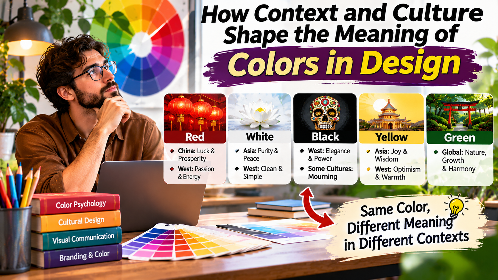
The same color can tell a completely different story.
Colors do more than decorate a design. Their meanings change with culture, context, personal experience, and the way they are presented.
Imagine seeing a red button on a website. Depending on its label and surrounding design, you might interpret it as a warning, a sale announcement, an urgent notification, or an invitation to take action.
Now imagine seeing the same red color on a wedding invitation, a national flag, or a festive decoration.
The color has not changed, but its meaning may be completely different.
This is one of the most important lessons in color design: colors do not carry one fixed meaning that applies to every person and situation.
Color associations develop through cultural traditions, social experiences, visual conventions, and individual memories. They are also influenced by the other elements surrounding a color.
For designers creating websites, logos, packaging, advertisements, or digital products, understanding these differences can prevent confusing messages and help create more thoughtful visual experiences.
This guide explores how context and culture shape color meaning and explains how to make better color decisions for diverse audiences.
Why Colors Do Not Have Universal Meanings
Color psychology is often presented through simple statements such as blue means trust, red means excitement, and green means nature.
These associations can be useful starting points, but they are not universal rules.
A person’s interpretation of color depends on several overlapping influences.
These include cultural background, personal experiences, industry conventions, surrounding imagery, and the purpose of the design.
For example, green may suggest environmental responsibility in one advertisement.
In a financial application, the same green might indicate a positive account balance or successful transaction.
On a traffic signal, green communicates permission to proceed.
The color itself does not explain the message. The surrounding system gives it meaning.
Core Design Principle
Color meaning is created through context.
The same hue can communicate different ideas depending on where it appears, who sees it, and what other visual or written information accompanies it.
How Culture Influences Color Associations
Cultural traditions influence how people interpret colors.
These associations may develop through religious practices, festivals, historical events, clothing traditions, national symbols, and social customs.
However, it is important to avoid treating entire countries or cultural groups as though everyone shares identical preferences.
Color associations can vary within the same country according to region, generation, community, and personal experience.
The following examples illustrate why designers should investigate their intended audience instead of relying on universal color charts.
Red: Celebration, Attention, and Warning
Red is one of the most visually noticeable colors in many design environments.
In numerous Western digital interfaces, red is commonly used for errors, warnings, and destructive actions.
For example, a delete button may use red to signal that an action requires caution.
Red is also widely associated with romance, energy, and promotional messaging.
In Chinese cultural traditions, red has important associations with celebration, happiness, and good fortune.
It is prominently used during Lunar New Year celebrations and in many wedding traditions.
In parts of South Asia, red also carries significant associations with weddings and ceremonial clothing.
These examples demonstrate that red cannot be reduced to a single emotional meaning.
A red background that feels appropriate for a festive campaign may be less suitable for a medical warning page or financial error message.
White: Simplicity, Ceremony, and Mourning
White is commonly used in minimalist design because it creates a sense of openness and provides a neutral background for other elements.
In many Western wedding traditions, white bridal clothing has become strongly associated with weddings.
However, white also has historical associations with mourning in several Asian cultural traditions.
This does not mean that everyone within those cultures interprets white in the same way.
Rather, it illustrates how the symbolic meaning of a color can change according to social and ceremonial context.
In digital products, white may communicate cleanliness, simplicity, or spaciousness without directly referring to any cultural tradition.
Green: Nature, Progress, and Identity
Green frequently appears in environmental branding because of its association with plants and natural landscapes.
It is also commonly used to indicate success, availability, or positive status in digital interfaces.
In some cultural and religious contexts, green has additional symbolic importance.
For example, green holds historical significance in Islamic visual traditions.
However, green does not automatically communicate environmental responsibility, religious identity, or financial success.
Its interpretation depends on the surrounding message and audience.
Blue: Professionalism, Calmness, and Familiarity
Blue is widely used in technology, financial services, healthcare, and corporate branding.
It is often selected because designers want to communicate stability or professionalism.
However, the belief that blue universally creates trust is an oversimplification.
People evaluate credibility through many signals, including clear information, product quality, recognizable branding, usability, and prior experience.
A poorly designed website does not become trustworthy simply because it uses blue.
Color can support a message, but it cannot replace genuine credibility.
A Quick Reference: How Color Meanings Can Vary
The table below summarizes some commonly encountered associations. These are illustrative examples, not fixed meanings for every culture or individual.
| Color | Possible Associations | Design Consideration |
|---|---|---|
| Red | Celebration, romance, danger, urgency | Check whether the context is festive, promotional, or cautionary. |
| Blue | Calmness, professionalism, familiarity | Support credibility with clear content and usable interfaces. |
| Green | Nature, success, renewal, cultural identity | Avoid assuming green always means environmentally friendly. |
| Yellow | Warmth, attention, optimism, caution | Check readability and avoid overly intense backgrounds. |
| Purple | Creativity, ceremony, luxury, spirituality | Consider industry expectations and audience familiarity. |
| Black | Elegance, authority, formality, mourning | Use typography and imagery to establish the intended mood. |
| White | Simplicity, cleanliness, ceremony, mourning | Evaluate the specific cultural and visual context. |
The most important takeaway is that a color association should be treated as a possibility to investigate rather than a guaranteed psychological response.
Context Can Change a Color’s Meaning Immediately
Culture is only one influence on color interpretation.
The immediate visual context can be equally important.
Consider the color red in three different interface situations.
ONLINE SHOPPING
Red draws attention to a promotional offer.
ACCOUNT SETTINGS
Red emphasizes a potentially destructive action.
CELEBRATION
Red contributes to a festive visual atmosphere.
All three examples use a similar red color.
Yet the meaning changes because of the words, surrounding elements, and purpose of the interface.
This is why designers should never evaluate a color completely separately from the content it supports.
How Industry Conventions Influence Color Choices
Different industries develop recognizable visual patterns over time.
Healthcare websites often use restrained palettes, clear typography, and generous spacing.
Environmental organizations frequently incorporate greens, earth tones, or nature-related imagery.
Luxury brands may use limited color palettes, dark backgrounds, metallic accents, or minimalist layouts.
Technology companies often use blues, purples, gradients, and neutral interface colors.
These are tendencies rather than strict rules.
A healthcare brand can use warm orange successfully, and a technology company can build a recognizable identity without using blue.
The important question is whether the chosen colors support the brand’s actual message and user expectations.
Industry conventions can help users recognize familiar patterns, but excessive imitation may make brands difficult to distinguish.
Personal Experience Also Shapes Color Perception
Not every difference in color interpretation comes from culture.
Individual experiences can create strong associations with particular colors.
A person may connect yellow with childhood memories, blue with a favorite sports team, or green with a familiar school uniform.
Someone who has repeatedly encountered red error messages may interpret red interface elements as warnings even outside that context.
These learned associations influence how people respond to designs.
Age, familiarity with technology, personal preferences, and visual abilities can also affect color perception.
Because designers cannot predict every individual response, they should focus on clarity, consistency, and testing with representative users.
Designing for International Audiences
Websites and digital products frequently reach people across national and cultural boundaries.
A website created in the United States may attract visitors from the United Kingdom, Canada, Australia, India, Singapore, and many other countries.
International reach creates an important design challenge.
Colors that seem familiar in one market may carry different associations elsewhere.
However, designers should avoid replacing one oversimplification with another.
It is not enough to assume that every visitor from a particular country interprets a color identically.
Instead, investigate the actual audience.
Consider the product category, regional conventions, language, imagery, and intended emotional tone.
For a global financial application, familiar interface patterns and clear labels may matter more than choosing a color associated with trust.
For a wedding-related product, local ceremonial traditions may deserve more attention.
For a global educational platform, readability and consistent navigation may be the highest priorities.
International Design Tip
Research the audience, not just the country.
Regional location can provide useful context, but language, community, product expectations, and real user feedback are often more informative than broad national color stereotypes.
How Color Meaning Changes in Website Design
Website colors influence how users recognize information and interact with controls.
However, their meaning should be established through a consistent interface system.
For example, if green indicates a completed task, that meaning should remain consistent across the application.
If red identifies destructive actions, it should not be used randomly for unrelated buttons that perform ordinary tasks.
Inconsistent color usage can confuse visitors.
Designers should also consider the relationship between color and typography.
A bright accent may work well for a decorative icon but poorly for a long paragraph.
Similarly, a muted color may look elegant as a background but fail to provide sufficient contrast for important text.
Good website design uses color to reinforce hierarchy rather than expecting color to communicate everything independently.
The Role of Saturation and Brightness
The meaning of a color can also change when its appearance changes.
A bright, highly saturated red may feel energetic or urgent.
A muted burgundy can appear more restrained and formal.
A vivid green may attract attention, while a soft sage green can create a quieter visual atmosphere.
These impressions are influenced by context and are not guaranteed emotional responses.
Nevertheless, saturation and brightness are important design tools.
Instead of changing the hue completely, designers can create different moods by adjusting its intensity and value.
This approach is useful when building a consistent brand palette.
A primary brand color can be supported by darker shades, lighter backgrounds, and muted variations without introducing unrelated hues.
Color Accessibility Across Different Audiences
Color interpretation is not only a cultural issue. It is also an accessibility consideration.
People with color-vision deficiencies may have difficulty distinguishing certain combinations.
For example, relying only on red and green to distinguish errors from successful actions can create problems for some users.
Important information should be supported by text, icons, labels, or other meaningful indicators.
Text contrast is another essential consideration.
Under WCAG Level AA, normal text generally requires a contrast ratio of at least 4.5:1, while large text generally requires at least 3:1.
Important non-text interface components may also be subject to contrast requirements.
Designers should test actual foreground and background combinations instead of assuming that colors with different names provide sufficient contrast.
Accessible design helps create clearer experiences for users across many cultures and abilities.
How to Research Color Preferences Before Designing
Research does not always require an expensive study.
Even small projects can benefit from a structured approach.
Begin by examining the visual conventions used in the target industry.
Look at established websites, product packaging, public information materials, and other relevant examples.
Identify patterns without assuming that those patterns are mandatory.
Next, consider the intended audience and the situations in which the design will appear.
A color palette for a mobile banking application may need to prioritize clarity and status recognition.
A palette for a cultural festival may need to reflect specific traditions and event imagery.
Create several alternatives and test them with representative users where possible.
Ask participants what they think the design communicates before explaining the intended message.
Their responses can reveal unexpected interpretations that would not be obvious from a color theory chart.
A Practical Framework for Choosing Culturally Appropriate Colors
When designing for a diverse audience, use the following framework to guide your decisions.
This process makes color selection more intentional and reduces dependence on assumptions.
Common Mistakes in Cross-Cultural Color Design
One of the biggest mistakes is assuming that a single color psychology chart applies everywhere.
Such charts may provide inspiration, but they rarely capture the complexity of real cultural experiences.
Another mistake is treating a country as a single uniform audience.
Large populations contain many communities, traditions, and individual preferences.
Other common mistakes include:
- Choosing colors based only on personal preference.
- Assuming that familiar Western interface conventions are universal.
- Using cultural symbolism without understanding its context.
- Relying on color alone to communicate warnings or instructions.
- Ignoring accessibility and text contrast.
- Copying competitors without evaluating the intended audience.
- Failing to test colors with real users.
Thoughtful designers recognize that color meaning is flexible and that research is more reliable than stereotypes.
Frequently Asked Questions
Do colors mean the same thing in every culture?
No. Color associations can differ across cultures, communities, historical periods, and personal experiences. Context also influences interpretation.
Why is red considered lucky in some cultures?
Red has longstanding celebratory associations in certain cultural traditions, including Chinese festivals and weddings. Its significance comes from historical and social customs rather than a universal psychological rule.
Is blue always the best color for a trustworthy brand?
No. Blue is common in professional branding, but trust depends on many factors, including transparency, reliability, content quality, and user experience.
How can designers avoid cultural mistakes?
Research the target audience, investigate relevant traditions, avoid broad stereotypes, and test design alternatives with representative users.
Does color psychology work in website design?
Color can influence attention, recognition, and perception, but its effects depend on context. It should be used alongside clear content, accessible interfaces, and user research.
Can one color palette work for an international website?
Yes. A consistent global palette can work well when it is accessible, understandable, and tested across relevant audiences. Some campaigns or regional experiences may benefit from carefully considered local adaptations.
Final Thoughts: Design Meaning, Not Just Color
Colors are powerful visual tools, but their meanings are not fixed.
The same red can communicate celebration, romance, urgency, or danger. White can suggest simplicity in a digital interface while carrying different ceremonial associations in other settings.
Culture, personal experience, industry conventions, and immediate visual context all contribute to how people interpret color.
For designers, this means color selection should involve more than choosing attractive combinations.
It requires understanding the audience, defining the intended message, and testing whether the final design communicates clearly.
Accessibility should also remain a priority, because a meaningful color palette is only useful when people can perceive and understand the information it supports.
By combining color theory with cultural awareness and practical user research, designers can create visual experiences that feel thoughtful, inclusive, and appropriate for their intended audiences.
The Essential Design Lesson
Color does not communicate alone. Context gives it meaning.
Research cultural associations, consider the surrounding design, maintain accessibility, and validate your choices with the people you want to reach.